We recently gave Greptile a brand refresh, and we did it entirely in-house.
This was not just a visual update. It was a way to give a technical product a clearer shape.
Greptile does a lot under the hood. It reads code, finds problems, understands context, and helps teams move faster. As the product grew, we needed more from the brand. We needed something that could explain that complexity without feeling messy. Something precise, but not cold.
Most brands play it safe. We didn't do that the first time, and we weren't going to do it now.
Looking backward to move forward
Nostalgia is often seen as looking backward. Our approach is different.
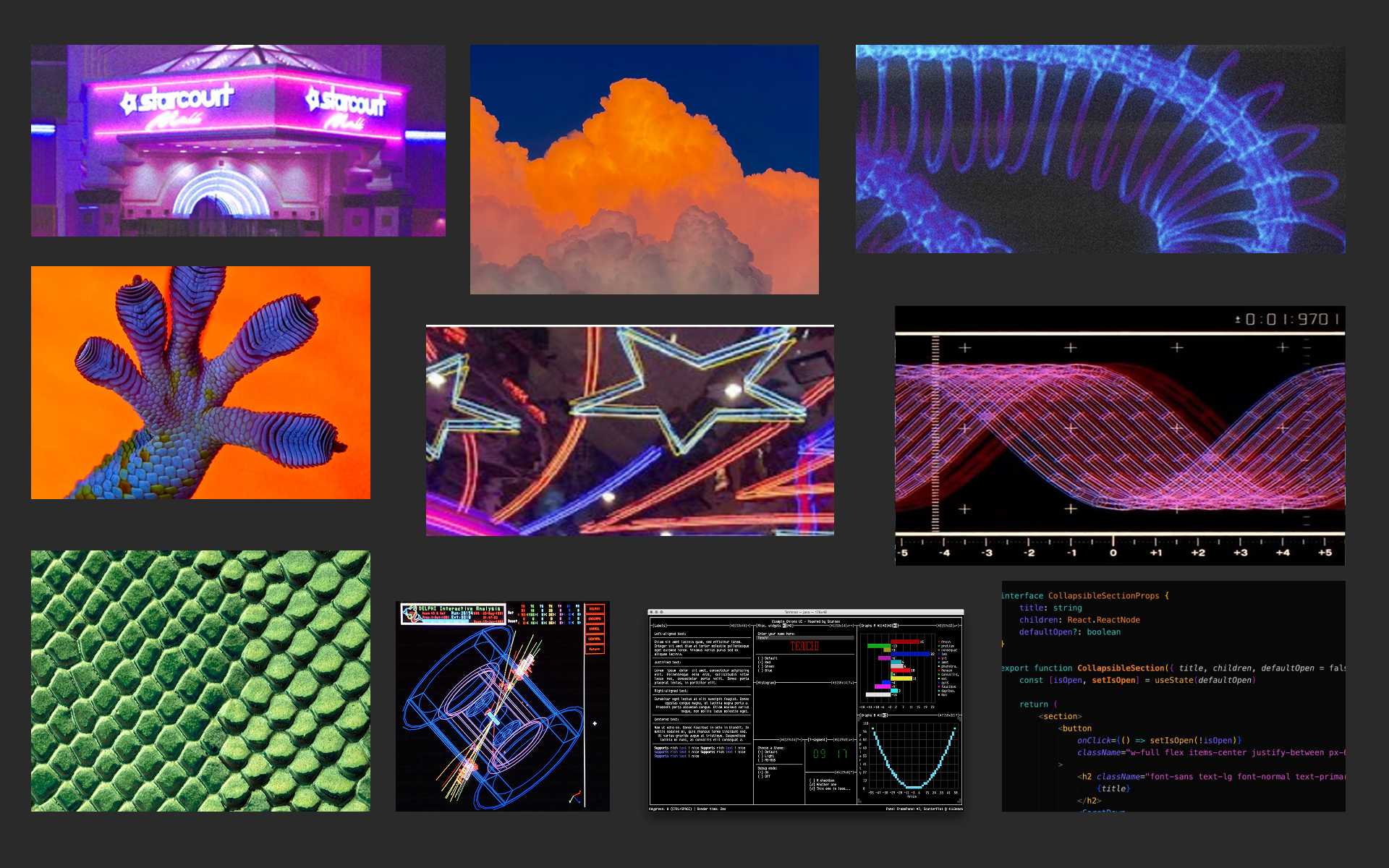
We pulled inspiration from moments in the past that once felt futuristic: old video games, 80s malls, Neon Genesis Evangelion, and the visual language of early tech companies that made software feel big and cinematic.
We also looked at the tools developers use every day. Terminals and IDEs have always been surprisingly colorful, full of syntax highlighting, bright prompts, and contrasting themes. That visual language became an important reference point too.
Lastly, we couldn't forget about reptiles. Their repeating scales, sharp geometry, unusual colors, and vivid environments all felt like a natural fit for Greptile.
That mix gave us a broader color palette, more intricate illustration work, and a system of modular geometric forms. The result feels detailed and precise, but still a little strange in a good way.
That was the goal. Not retro for the sake of it. We wanted Greptile to feel like it had always belonged somewhere in the history of technology.
The logo had to do more work
Greptile's logo represents a few things at once:
- a reptile eye
- a tile that can stand alone or fit into a larger tessellated system
- a "G"
That mattered to us because the mark needed to behave like the brand itself. It had to work on its own, but it also had to be part of something bigger.
A good logo is not just a badge. It is a building block.
The geometry is also a nod to the tech marks of the 80s, when companies used isometric forms and hard edges to make software feel tangible. Those logos had presence. They felt engineered.
The new logo gives us more room to build. It can become a pattern, a motion system, a product element, or a piece of merch without losing its shape.
Why rebrand at all?
Greptile is evolving, and the old brand wasn't giving us enough room to communicate that.
As Greptile expands, the brand needs to stretch with it. It has to hold product, motion, illustration, merch, and everything else that comes next. We didn't want a brand that only looked good on a landing page. We wanted one that could carry a whole system.
Making code review visible
Software bugs are usually shown very literally. One bug, one icon.
That never felt right for us.
A real bug does not feel like a cartoon insect. It feels like interference. A glitch in the signal. A tear in the system. Something slightly wrong that can spread if you miss it.
So in the new brand language, bugs become distortions. Broken pixels. Visual instability. Something you want to identify and get rid of quickly. Greptile is now represented through tiles or pixels that acts on those problems. It gives us a simple way to visualize a complicated product.
A brand with somewhere to go
The best part of this refresh is that it doesn't stop at the logo.
You can already start to see how the pieces work together across illustration, motion, merch, and product.
We want to make it feel familiar in a deeper way. Like it belongs in a longer story about technology, while still feeling unique and identifiable.